Barriers at the time were lack of explanation of what QuickBooks did as saas accounting software to prospective users from the home page.
User insights, quickbooks visitors visit the site on the term “quickbooks,” thinking it’s an accounting product, but they can’t easily learn about what it did from the onset.
Prospects know they need accounting, but don’t necessarily understand accounting. Consequently they want to see and experience the product at various depths.
Role: Lead Visual Designer
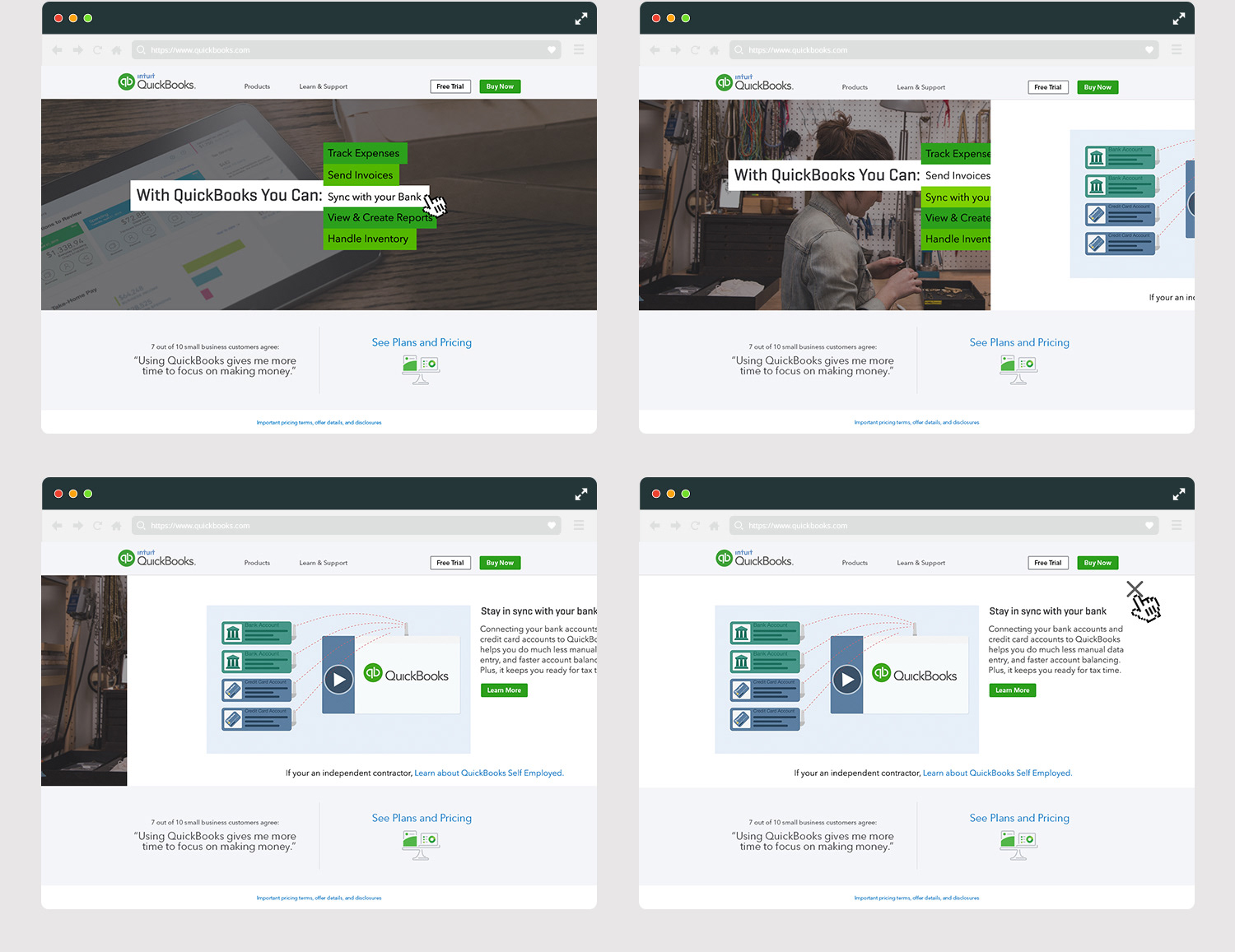
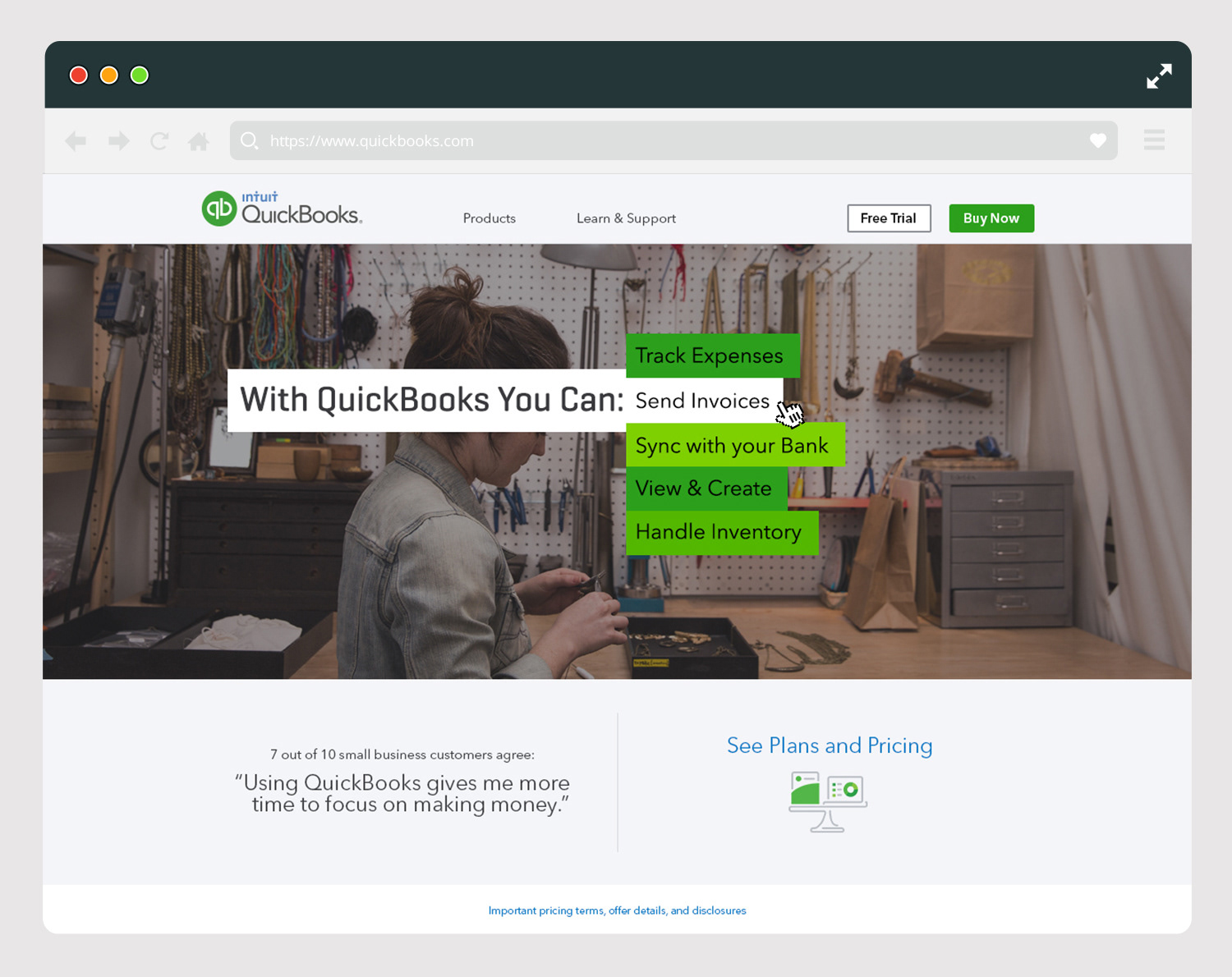
Based on data from focus groups and initial user testing, we created simple quick experience that was able to deliver important features about quickbooks. Giving users small bite size of information about the over all product features and funneling them to the product page ware we then expanded on features, and explained specifics of the varies product offerings.
Live clip recording of a user interacting with the prototype.
Further testing after the prototype was built supported our hypophysis users' reacted more favorably and learned quicker what Quickbook software did than the previous ambiguous content used on the home page.

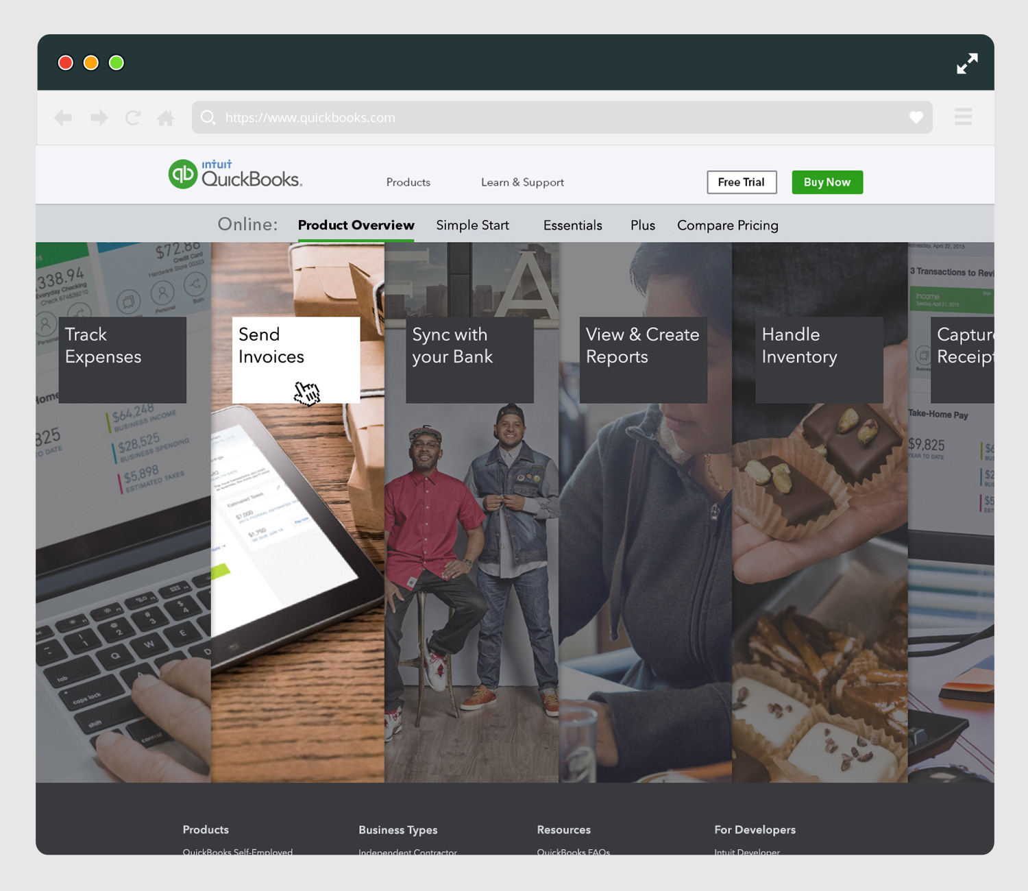
Product Section Concept 2