Walmart eCommerce
Role: Lead Product Designer
The Team
Worked closely with the business partners/stakeholders, product managers, my director, and the testing team. Touching bases with other teams in the org, ware the new components would intersect with.
Worked closely with the business partners/stakeholders, product managers, my director, and the testing team. Touching bases with other teams in the org, ware the new components would intersect with.
Pain Points
• Users are not sure that the products they are finding fit there vehicles. Example high returns on tires.
• The business present tire finder is hidden and not easy to use and not built for scale
• Users are not sure that the products they are finding fit there vehicles. Example high returns on tires.
• The business present tire finder is hidden and not easy to use and not built for scale
The Business ask
To create a search component that makes it easy, quick, and more concise for users to find automotive parts (tires, wipers, oil filters, etc ) at various entry points in a user's journey in Walmart app (iOs and Android) and in R-web.
To create a search component that makes it easy, quick, and more concise for users to find automotive parts (tires, wipers, oil filters, etc ) at various entry points in a user's journey in Walmart app (iOs and Android) and in R-web.
User Target
From the savvy automotive do it yourself person to the non-automotive person that simply is looking for a bargain.
From the savvy automotive do it yourself person to the non-automotive person that simply is looking for a bargain.
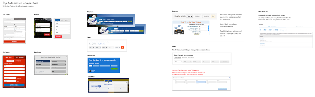
Research
Competitor UI/UX Research and analysis quickly showed multiple problems with Walmarts outdated tire search component and overall lack of strategic thought in the automotive tires and parts sector.
Ideation and Testing

Throughout the process, we developed various concepts on whiteboards, paper, and Sketch App. Eventually reaching a consensus with our partners then moving on creating a prototype in invision and a quick bata release on the mobile app for testing. And latter on further testing for responsive desktop.
And obviously, learning's in testing brought a few more rounds of iterations to the process before we reached a place where we could hand over to engineering.
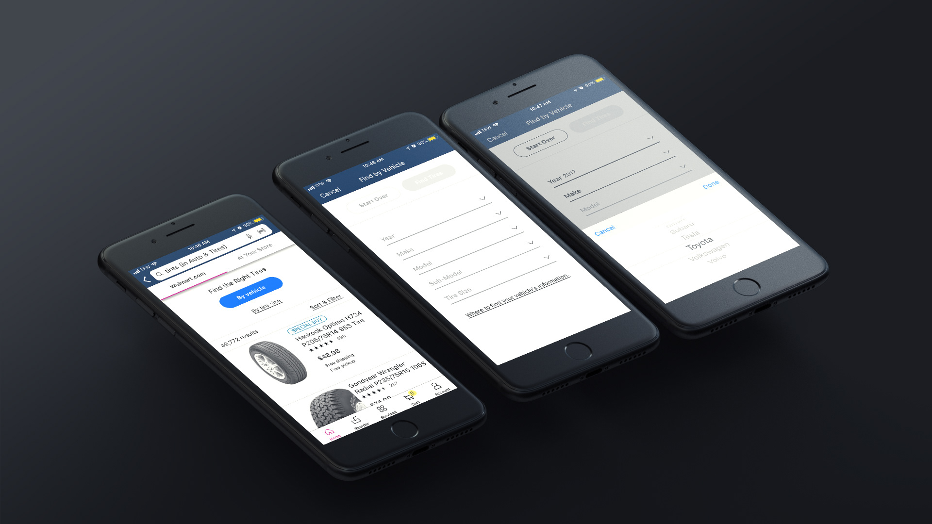
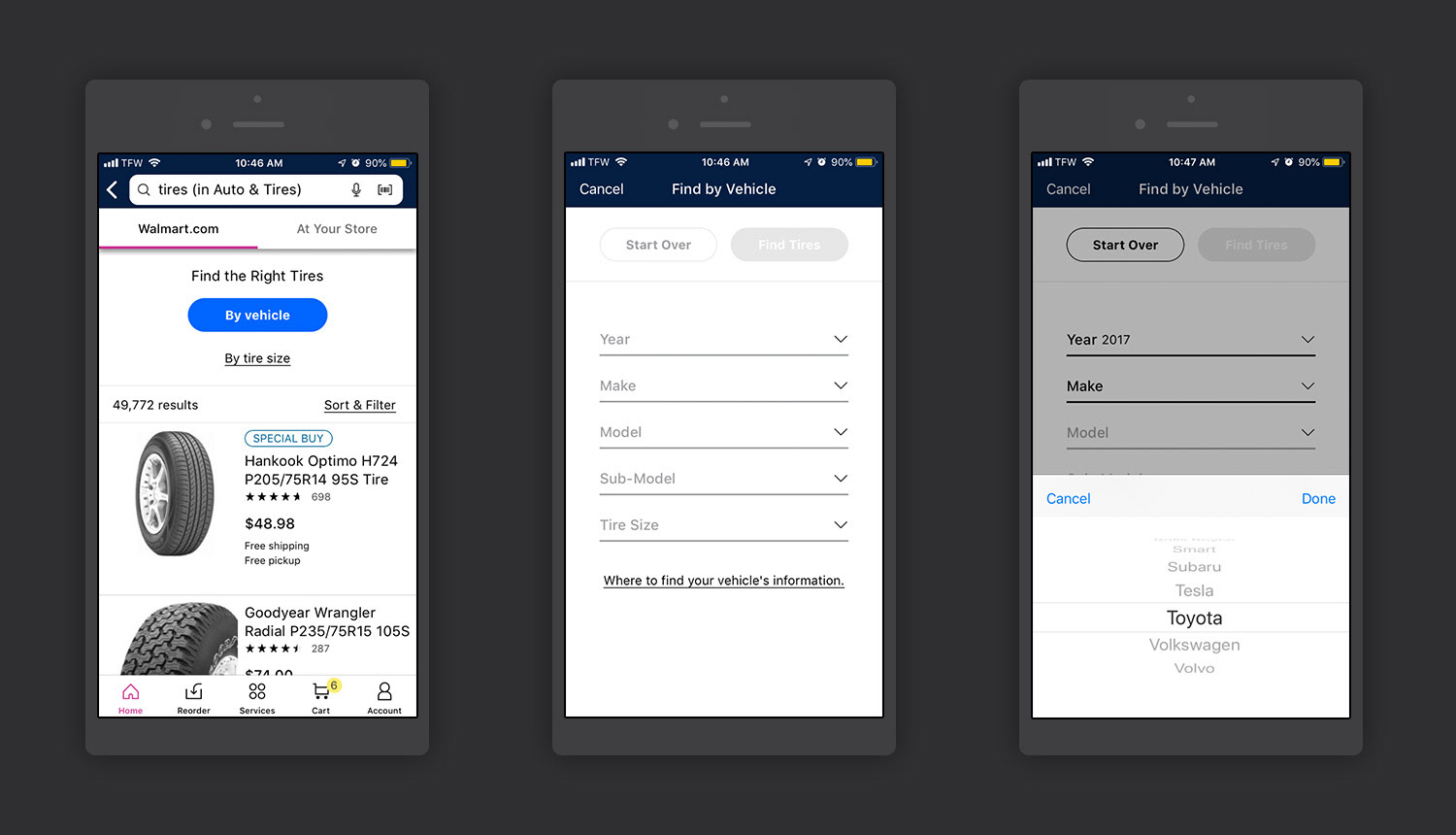
Basics of the component
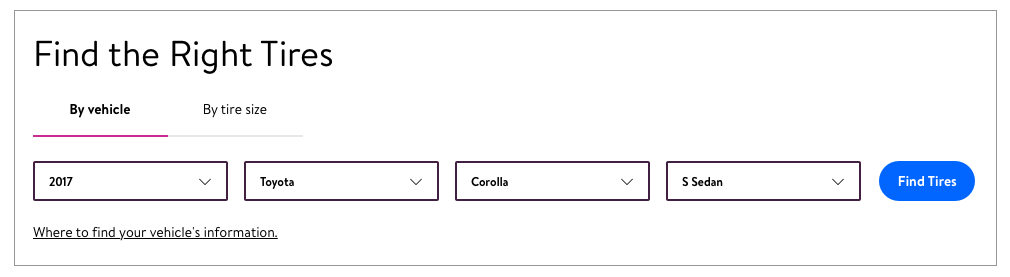
The experience is a linear one, by that I mean you choose one drop-down after the other until you reach the last drop-down at which point the CTA goes active. You can have up to 3-5 drop-downs at any given time based on the search variables attributed to an item.
Specifics
1. Header title.
2. Tabs are used for other variations of searching, in the case of tires It would be by tire size.
3. Drop-down variables.
4. Information model.
1. Header title.
2. Tabs are used for other variations of searching, in the case of tires It would be by tire size.
3. Drop-down variables.
4. Information model.
Mobile Break Point & App
Mobile iOs and Android
The early prototype was used for quick live testing in iOs and android App to validate certain ideas we had the test ran for about a month. Specifically focused on tires only. This test showed a 20% rise in tire sales.
iOs example being shown only includes Part 1 of the project.

Responsive Web, Desktop Break Point

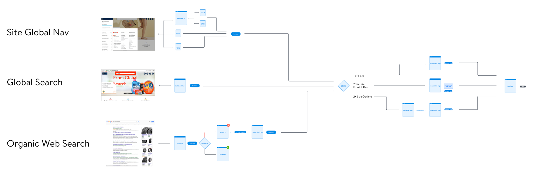
User Entry Points for Responsive Web
The three main entry points for users were through the use of Global Site Hamburger Nav, Global Search, and organic web search through google pages.
Basics of the component for desktop breakpoint
The experience is a linear one, by that I mean you choose one drop-down after the other until you reach the last drop-down at which point the CTA goes active. You can have up to 3-5 drop-downs at any given time based on the search variables attributed to an item.
Specifics
1. Header title.
2. Tabs are used for other variations of searching, in the case of tires It would be by tire size.
3. Drop-down buttons and CTA.
4. Information model.
1. Header title.
2. Tabs are used for other variations of searching, in the case of tires It would be by tire size.
3. Drop-down buttons and CTA.
4. Information model.

Variables in drop-downs that are not picked yet.
Variables in drop-downs picked. Button goes live state signaling user to proceed.
For responsive web three main entry points shown are
1. Automotive landing page from the main navigation
2. User does a search using the global navigation
3. Organic Google search from an Ad-sense banner takes you to a specific item page.
1. Automotive landing page from the main navigation
2. User does a search using the global navigation
3. Organic Google search from an Ad-sense banner takes you to a specific item page.
Testing on desktop
Usability Testing involved qualitative in house study with about 15 users on desktop using Invision prototype. This helped out in understanding users' pain points in the flow with the design and taxonomy issues.
Usability Testing involved qualitative in house study with about 15 users on desktop using Invision prototype. This helped out in understanding users' pain points in the flow with the design and taxonomy issues.
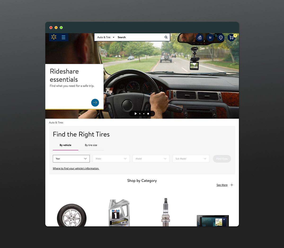
1. Automotive landing page
A note to viewers. Only involved with the creation and placement of the component. All other aspects of the pages were handled by multiple teams which i had to interact with to make sure those experiences were not being impacted negatively.
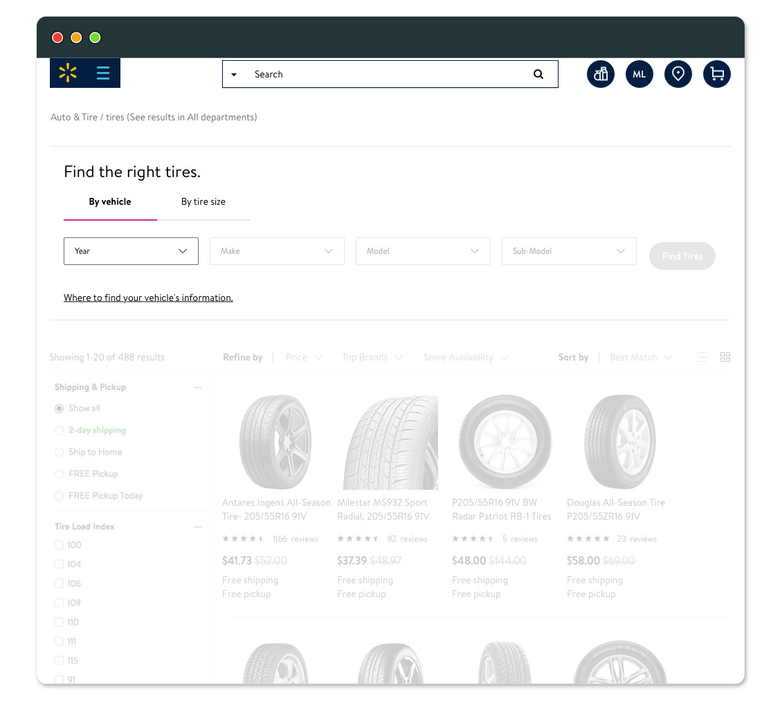

2. Shelf Page: from the global search navigation. 3. Product page: coming from organic google search.
Whited out sections on the page are for purposes of showing the specific component I worked on.
Whited out sections on the page are for purposes of showing the specific component I worked on.
Part 2
The user's vehicle information is saved. Messaging helps validate the choice the user has taken is correct.
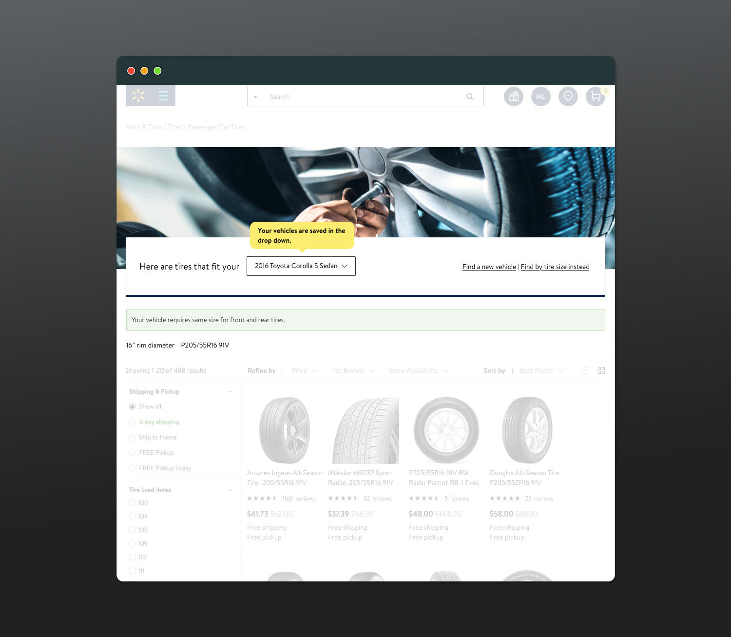
Whited out sections on the page are for purposes of showing the specific component I worked on.
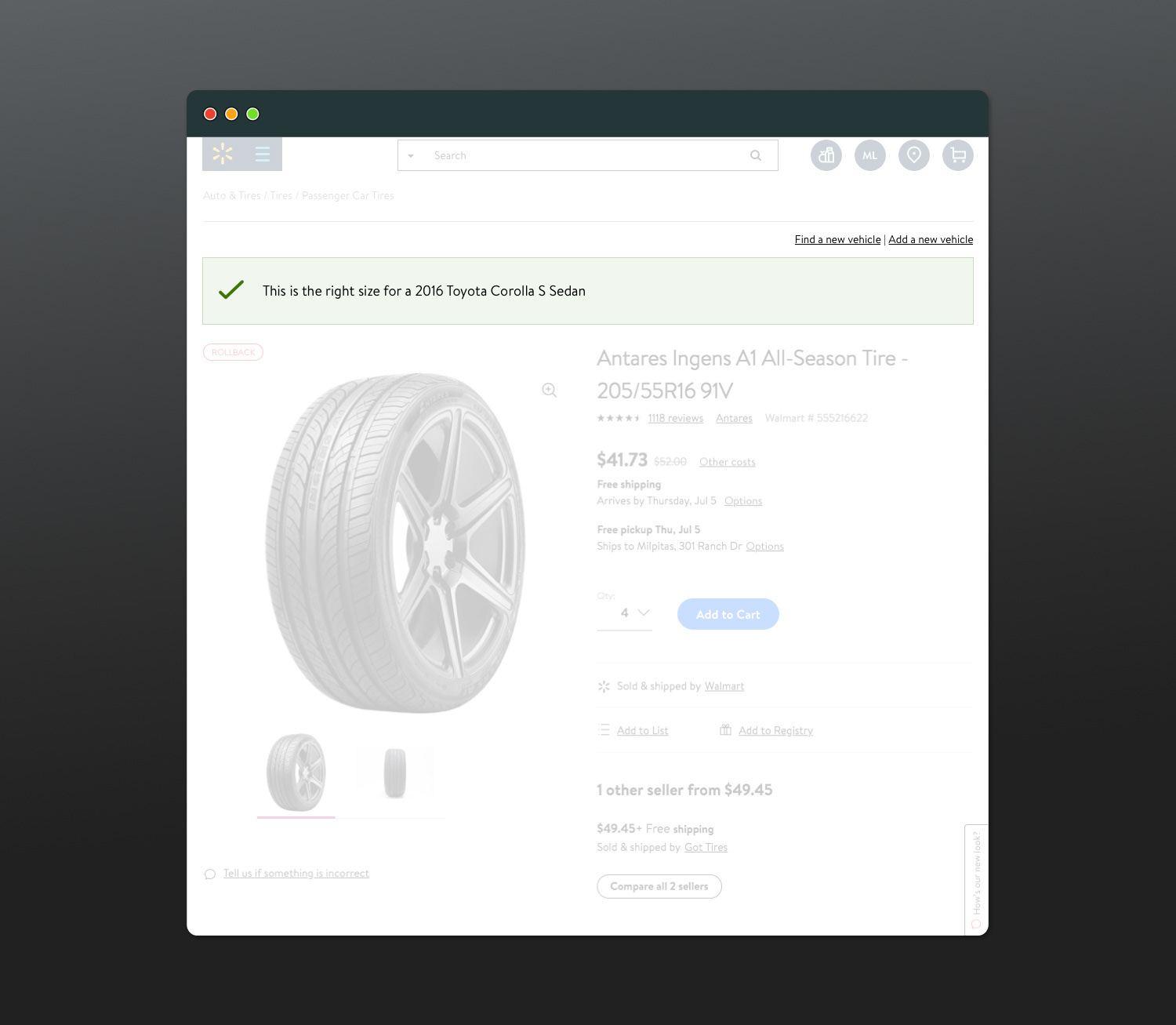
Part 3
The user has chosen the item and is sent to the item page, again reaffirming that the item he has chosen is correct pushing him closer to purchasing the chosen item.
Whited out sections on the page are for purposes of showing the specific component I worked on.